
The 20
UI | UX
The 20 is a group of MSPs all sharing a single, true nationwide IT Support Desk for a member's business, owned by the members.
Problem
The 20 needed an update to their website that would communicate a clear message about their services and elevate their brand.
Solution
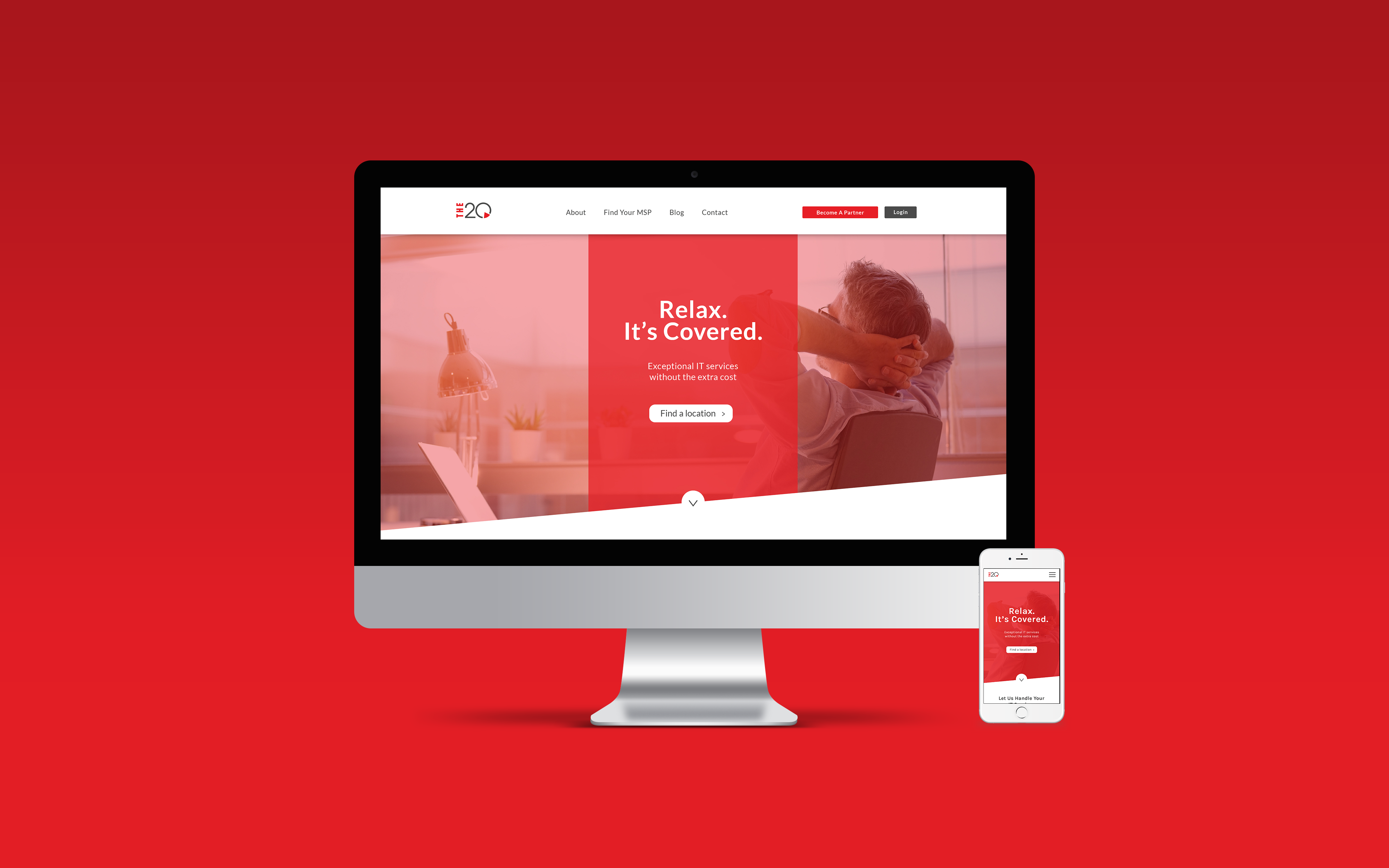
The new design for their homepage had a few requirements. The organization loved their red and wanted us to incorprate that as much as possible. A video header and my Creative Director had the idea to incorporate an interactive graphic using a platform called Ceros. We presented two solutions for the client to chose.

The 20 selected the design on the right and I would use this to build out the remaining interfaces. Their updated website would be hosted on Wordpress.

A lot of The20's business came from mobile traffic, so I collaborated with my creative director, Megan, about how to incorporate specific features like finding locations of IT service providers and contacting them on a map from a mobile device. We had to keep in mind, the user would utilize this service the most.
I researched Google maps and other websites that used search features to get a feel for how to organize information and present it to the user in the most effective manner.
The final product exceeded the client's expectations, giving an energectic and effective message to users about The 20's services.