
VertexOne
Branding & Marketing | Production | UI | UX
VertexOne partners with utilities and energy service providers to deliver world class customer experience by reducing risk and maximizing value through improved customer operations.
Problem: Cold and Sterile Messaging
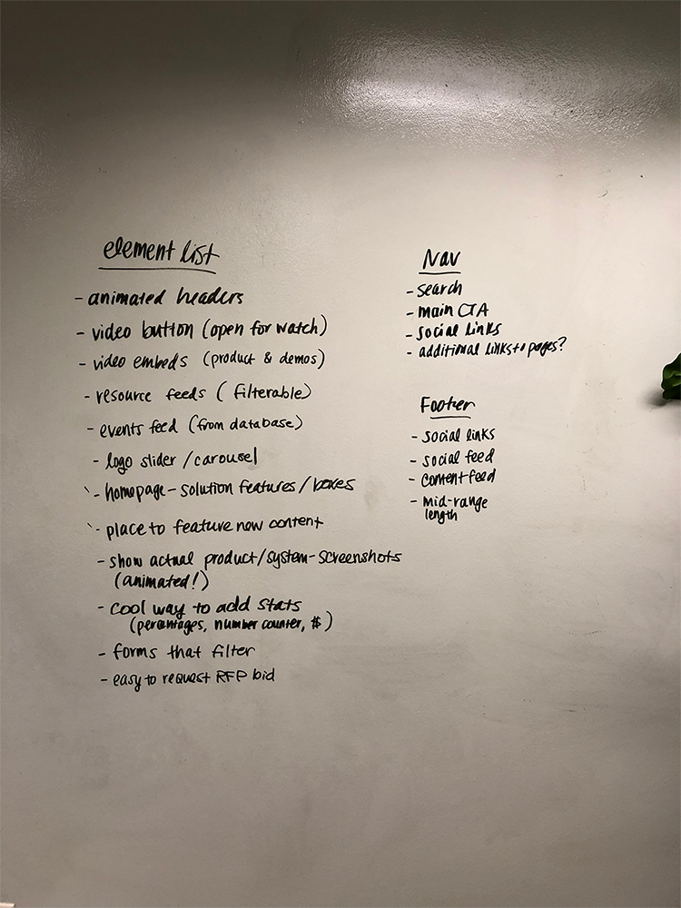
Although VertexOne was successful in its unique way in the market place, it was having trouble communicating its brand messaging and attracting more customers. Their website and social media messaging needed an update and working with my agency, we worked in a collaborative team to execute.
Solution: From Cold to Warm
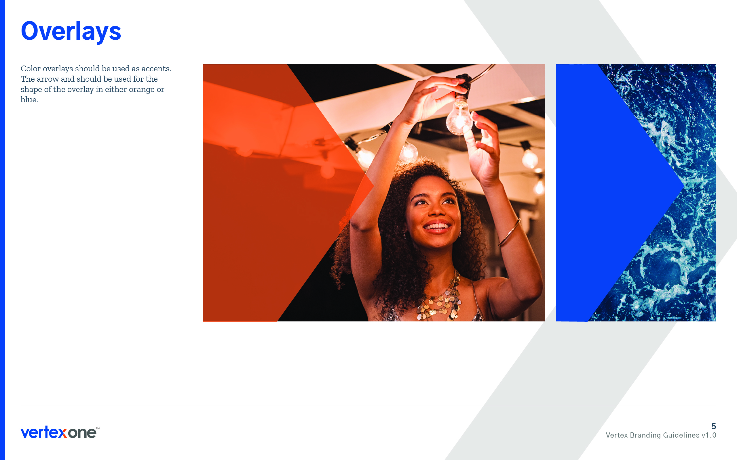
Our team started with new messaging and a web redesign. I came up with a new web branding style guide for their web messages. The concept was to convey emotional storytelling to give their brand a warm and inviting feel. I chose photography of families and friends living their lives because of utitiles like electricity powering the lights to read bedtime stories or cooking over gas stoves. I came up with imagery of bright colorful hot air ballons in the sky and classic element images of fire, air and water to further push the emotional factor. We kept their original color palette with heavier use of their blue but chose new typography. To make the brand more unique, I took the "x" in their current logo and turned it into an arrow for forward progress. This would lead to a logo change later in the process.


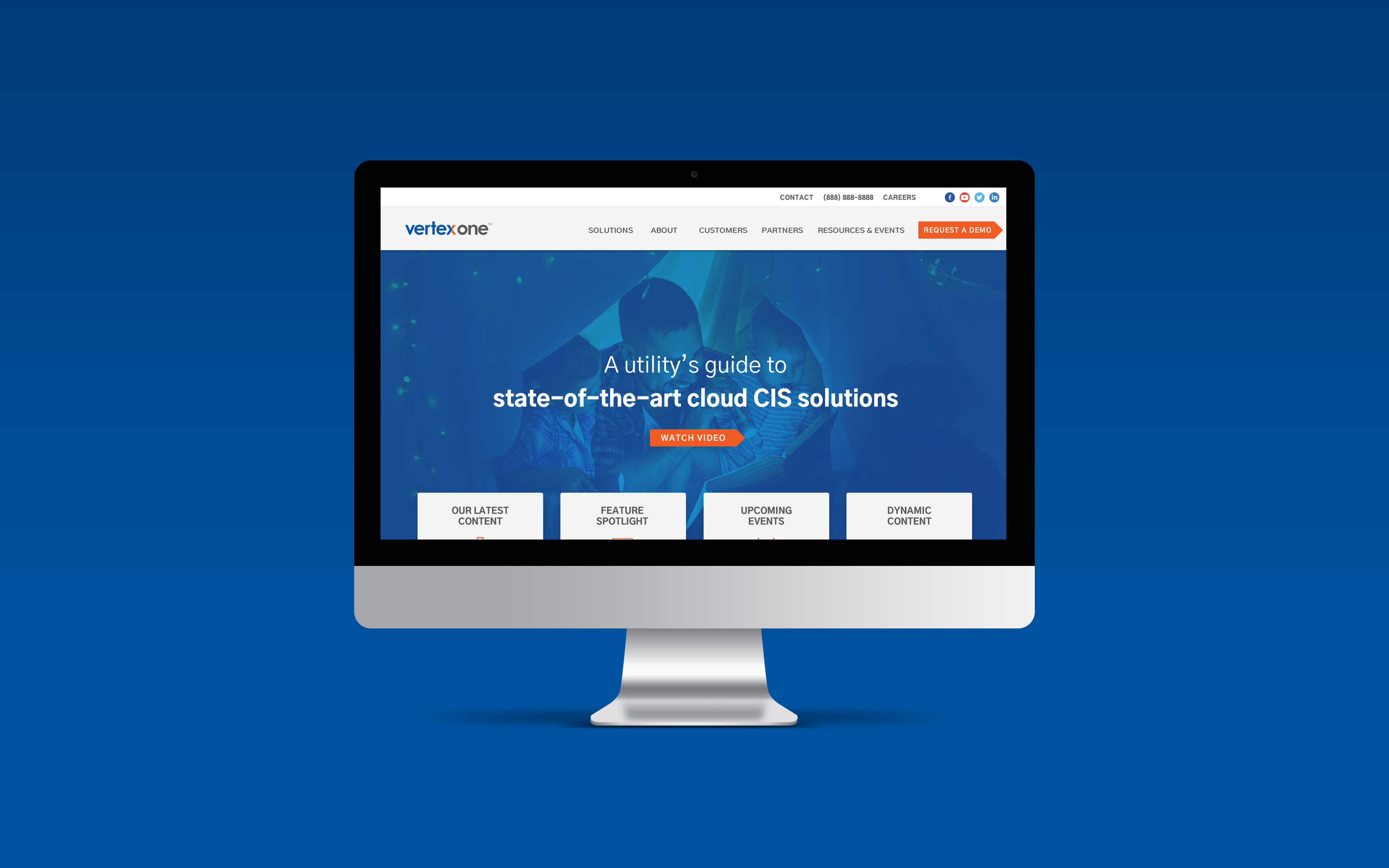
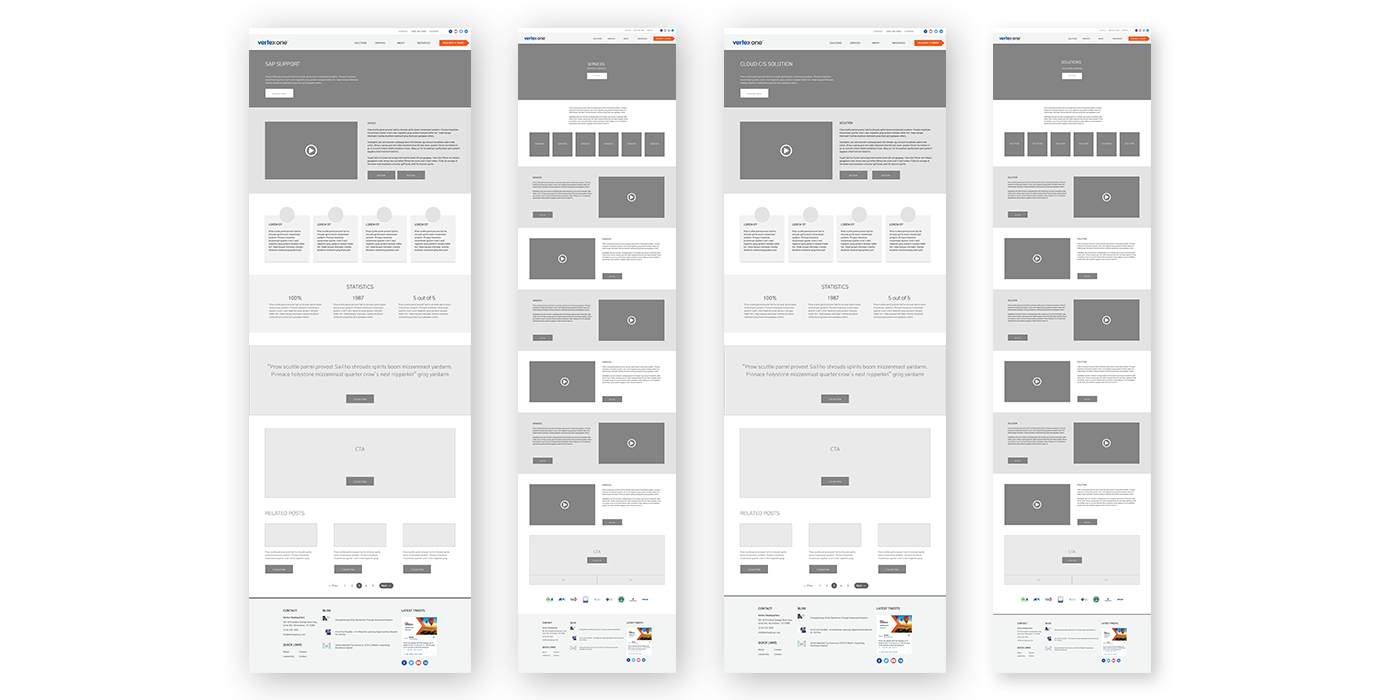
My Creative Director and I collaborated on the visual design for the homepage. We had a little competition by presenting two options.
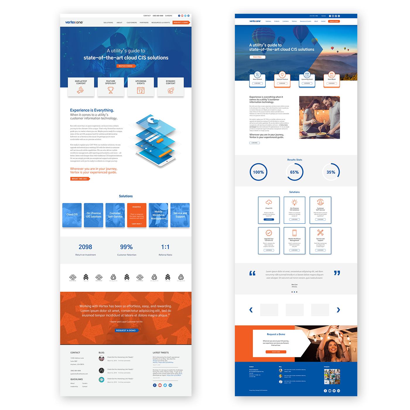
After the client selected the homepage that would become the face of their brand(the left), I then ran with user interface elements to build out the next phases of the site. There was a heavy concentration on the product and solutions pages they offered and the pages that lead the user to them. They had to look similar for cohesive purposes but different enough so the customer could distinguish the difference in products.
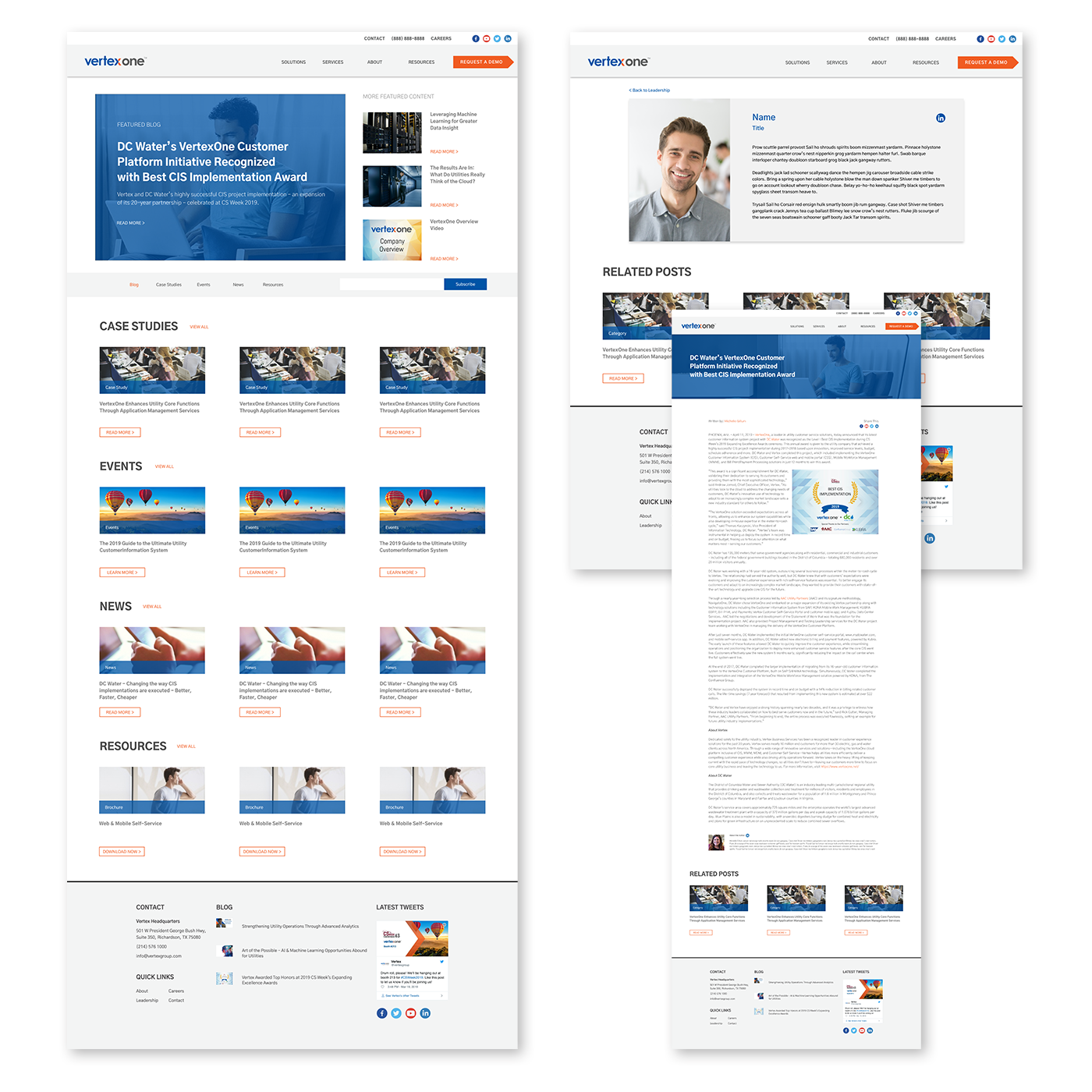
The website, built in HubSpot, expanded into creating leadership, resource and blog pages to finish out the details. We successfully created a refreshed look for the brand that works behind the scenes to help so many customers.
With this refreshed design came the need for a tweaked logo to reflect the forward progression of the brand.
before

after